Choose painting materials based on technique objectives, working environment, time constraints, and permanence requirements for optimal artistic results.

Painting Supplies Purchase Guide
Walk into any art supply store and you'll face an overwhelming wall of paint tubes, each promising vibrant colors and professional results. Cadmium red next to quinacridone magenta next to alizarin crimson—dozens of reds alone, never mind the blues, yellows, and everything in between. Then there's the question of medium: oils that take days to dry, acrylics that set in minutes, watercolors that demand a completely different mindset.
Here's what centuries of painting tradition have taught us: the medium you choose fundamentally shapes how you work. Oils give you time—luxurious hours to blend a portrait's skin tones or rework a troublesome passage. Acrylics demand decisiveness but reward you with versatility, letting you paint thin glazes one moment and thick impasto the next. Watercolors require a different kind of courage entirely, embracing transparency and the occasional happy accident.
This isn't about finding the "best" medium (there isn't one). It's about matching materials to your working style, your timeline, and what you're actually trying to create. A plein air painter racing against changing light needs different tools than a studio artist building up layers over weeks.
Choosing Your Medium: What Actually Matters: Forget the romantic notion that real artists only use oils, or that acrylics are somehow less legitimate. Professional artists choose media based on practical considerations: How fast do you need to work? What kind of surface are you painting on? Do you have proper ventilation? Can you wait days between sessions, or do you need to finish tonight?
Complete Guide Navigation
Painting Medium Selection Framework: Complete Decision Guide
1. Medium Characteristics and Applications
Different painting media offer distinct properties that serve specific artistic goals and working methods.
Primary Painting Media Comparison:
| Medium | Drying Time | Working Properties | Best Applications | Professional Brands |
|---|---|---|---|---|
| Acrylic | 20 minutes - 2 hours | Water-soluble, fast-drying, permanent | Alla prima, mixed media, murals | Golden, Liquitex, Winsor & Newton |
| Oil | Days to weeks | Slow-drying, blendable, reworkable | Traditional techniques, portraiture | Winsor & Newton, Gamblin, Old Holland |
| Watercolor | Minutes | Transparent, reactivatable, luminous | Landscapes, botanical illustration | Winsor & Newton, Schmincke, Daniel Smith |
| Gouache | 30 minutes | Opaque watercolor, matte finish | Illustration, design work, studies | Winsor & Newton, Holbein, M. Graham |
| Tempera | 30 minutes | Fast-drying, matte, chalky | Icon painting, illustration, studies | Sennelier, Kama Pigments, Daler-Rowney |
Understanding Paint Quality: Where Your Money Actually Goes
Stand in front of the paint display and you'll see the same color name at wildly different prices. Winsor & Newton Cadmium Red in student grade costs $8. The professional version? $35. What's the difference besides the price tag?
Pigment concentration. Student-grade paints use less actual pigment and more filler—chalk, clay, extenders that bulk up the paint without adding color intensity. You'll use more paint to achieve the same color strength, and your mixtures come out muddier because you're mixing fillers together as much as colors.
Professional grades pack more pigment into every tube. That expensive Cadmium Red goes further, mixes cleaner, and covers better. Over time, the economics actually favor quality paint—you use less of it, waste less on disappointing mixtures, and your work looks better from the start.
The Quality Spectrum:
- Student Grade: Lower pigment load, synthetic alternatives to expensive pigments, perfectly fine for learning and practice. Brands like Winsor & Newton Cotman or Liquitex Basics give you real paint at accessible prices.
- Artist Quality: Higher pigment concentration, better lightfastness ratings, more consistent handling. This is where most working artists live—brands like Golden Heavy Body or Winsor & Newton Artists' provide professional performance without breaking the bank.
- Professional Grade: Maximum pigment density, finest grinding, premium lightfastness. When color accuracy and longevity matter most—for commissioned work, gallery pieces, anything meant to last generations.
- Master Grade: Historical formulations, rare earth pigments, museum conservation standards. These exist more as benchmarks than everyday working paints, though some artists swear by specific colors from lines like Old Holland.
Color Mixing Reality: Less Is Actually More
Beginning painters often make the same expensive mistake: buying every color in the display. Sixty tubes later, they're overwhelmed by choices and their mixtures still look muddy. Meanwhile, experienced painters work from limited palettes—sometimes just six colors—and mix everything they need.
The counterintuitive truth: fewer colors often produce more vibrant, harmonious results. When you truly understand how your specific reds, yellows, and blues interact, you can mix thousands of colors with confidence. Add too many pre-mixed convenience colors and you lose that intimate knowledge of how your palette behaves.
Smart Palette Building:
- Limited Palette (Primary Colors + White): Forces you to learn color mixing, creates automatic harmony. Start here. A warm and cool version of each primary gives you surprising range.
- Split Primary Palette: Warm and cool versions of red, yellow, and blue expand your mixing possibilities without overwhelming you. This is the sweet spot for most painters—maybe 8-10 colors total including white.
- Earth Tone Palette: Raw Umber, Burnt Sienna, Yellow Ochre, plus limited primaries. Classical approach that produces naturally harmonious, muted colors. Many portrait painters never leave this zone.
- Full Spectrum: Only expand to this once you've mastered a limited palette. Having thirty colors available doesn't make you paint better—it often makes decision-making harder.
The expensive tubes of Cadmium Red and French Ultramarine earn their keep. The seven shades of convenience green you thought you needed? They're gathering dust while you mix better greens from your core palette.
Questions Painters Actually Ask
What's actually different between student and professional paint?
Pigment concentration and filler content. Professional paints like Winsor & Newton Artists' or Golden Heavy Body pack more actual color into every tube, with less chalk or clay filler. Student paints like Winsor & Newton Cotman or Liquitex Basics work fine for learning but you'll use more paint for the same color intensity, and mixtures turn muddy faster because you're mixing filler together as much as pigment. The price difference reflects real material costs—cadmium and cobalt pigments are genuinely expensive.
Can I mix different paint brands together?
Within the same medium, yes—Golden mixes with Liquitex, Winsor & Newton with Gamblin. Each brand has slightly different formulations though, which affects handling. Golden flows differently than Liquitex, Old Holland feels different from Gamblin. Test combinations first, especially for important work. Mixing brands can affect drying time and film formation in ways that don't show up immediately.
Tubes vs. pans for watercolor—does it matter?
Tubes give you more paint volume and work better for large washes. Pans are portable and convenient for field work. Professional painters often use both—tubes in the studio (Winsor & Newton Professional, Daniel Smith Extra Fine), pans for plein air (Schmincke Horadam, M. Graham). Pans can dry out but rewet easily. Tubes stay fresh longer but you can waste paint squeezing out too much.
What mediums do I actually need for oil painting?
Start simple: linseed oil for thinning, Gamblin Gamsol for cleaning brushes. That covers basics. Add Gamblin Solvent-Free Gel for texture without fumes, Winsor & Newton Liquin if you need faster drying. Stand oil creates glazes. Cold wax medium builds matte surfaces. But many oil painters work for years with just linseed oil and solvent—mediums are tools, not requirements.
Does canvas quality really matter that much?
More than most beginners realize. Professional canvas like Fredrix Red Label or Masterpiece Artist Canvas uses quality cotton or linen with proper priming. Cheap canvas may have thin priming that lets paint sink through, loose weaving that sags, or acidic sizing that degrades over time. For practice and studies, cheaper canvas works. For paintings you want to keep, invest in quality ground.
What's the most versatile painting medium for someone starting out?
Acrylics offer the best combination of versatility, safety, and approachability. Quality lines like Liquitex Heavy Body or Golden Fluid Acrylics clean with water, dry quickly, and can simulate many techniques. Less intimidating than oils (no solvents, faster drying, easier cleanup) while still sophisticated enough for professional work. Many artists who start with acrylics never leave—they're not just a stepping stone to oils.
💡 Pro Tip:
Professional Color Mixing Secret: Invest in fewer, higher-quality colors rather than buying every shade. Six to eight professional-grade pigments mix more vibrant combinations than twenty student-grade tubes. Learn your palette intimately—know exactly what Ultramarine Blue and Burnt Sienna create together, test every two-color combination, understand which pigments overpower others. This knowledge is worth more than owning fifty pre-mixed colors.
Essential Painting Media
Acrylic Paints: Fast, Flexible, Forgiving
Acrylic paints offer something oils can't: speed. Finish a painting in one sitting. Paint over mistakes within the hour. Ship work the same day. For artists who need to move fast—whether that's stylistic choice or deadline pressure—acrylics deliver.
But that quick-drying nature cuts both ways. The paint that's wet on your palette at the start of a session will be plastic by lunch. That smooth blend you were working on? You've got maybe fifteen minutes before it's too tacky to manipulate. Acrylics demand a different rhythm than oils—more decisive brushwork, faster color mixing, constant awareness of your working time.
Modern acrylic technology has solved many early problems. Golden Open Acrylics stay workable for hours. Heavy body acrylics hold texture like oils. Fluid acrylics flow like ink. The versatility is genuine—you can paint thin watercolor-style washes one moment and knife on thick impasto the next, all with the same paint.
Professional Acrylic Lines Worth Knowing:
- Golden Heavy Body: The benchmark. Thick, buttery consistency. Serious pigment load. If you're moving from oils and worried about acrylic's reputation for being thin or weak, start here. Handles like oil paint but dries in hours instead of days.
- Liquitex Professional: Smooth, consistent flow. Excellent color stability. Less expensive than Golden but still professional quality. Their Heavy Body line works beautifully for traditional painting techniques.
- Winsor & Newton Professional: European formulation with intense colors and smooth handling. Slightly different feel than American brands—some painters prefer it, others find it takes adjustment.
- M. Graham Acrylics: Honey-based medium means slower drying and better flow. If you're frustrated by how fast standard acrylics dry, try these. They bridge the gap between typical acrylics and oils.
| Technique | Paint Consistency | Recommended Products | Applications |
|---|---|---|---|
| Impasto | Heavy Body | Golden Heavy Body, Liquitex Heavy Body | Textural effects, thick application |
| Glazing | Fluid/Thin | Golden Fluid, Liquitex Soft Body | Transparent layers, luminosity |
| Wet-on-Wet | Slow-Drying | Golden Open, M. Graham Acrylics | Blending, atmospheric effects |
| Detail Work | High Flow | Golden High Flow, Liquitex Ink | Precise lines, fine detail |
Oil Paints: Time, Tradition, and Unmatched Blending
Oil paints give you something precious: time to think. Lay down color in the morning, return after lunch and it's still workable. Blend edges until they disappear into nothing. Change your mind about that sky color on day three—the paint's still wet enough to rework.
This extended working time isn't just convenient, it enables techniques impossible with faster-drying media. The sfumato in Leonardo's portraits, Rembrandt's luminous shadows, the atmospheric landscapes of the Hudson River School—all depend on oil paint's willingness to stay blendable for days or weeks.
But working wet-into-wet for extended periods requires different thinking. You can't fix mistakes by simply painting over them an hour later—that fresh paint sinks into and muddies what's underneath. Oil painters develop strategies: fat over lean, saving the darkest darks for last, understanding how different pigments interact when mixed wet.
Oil Paint Lines That Deliver:
- Winsor & Newton Artists' Oil Colour: The reliable standard. Consistent quality across the entire color range. Available everywhere. When you need a specific color and need it to behave predictably, W&N delivers. Their cadmiums are properly dense, their earth tones mix cleanly.
- Gamblin Artist Colors: American-made oils formulated for contemporary techniques. Their Radiant line offers some of the most intense colors available. Excellent working properties and genuinely archival formulations—these chemists care about paintings lasting centuries.
- Old Holland: Premium European oils with maximum pigment concentration and historical formulations. Expensive but extraordinary. The titanium white alone will change how you think about opacity. These are investment paints.
- Michael Harding: Hand-crafted British oils made using traditional methods. Buttery consistency that knife painters particularly love. Each color has its own optimized formulation rather than a one-size-fits-all binder ratio.
Oil Painting Mediums: Controlling the Paint
Oil paint straight from the tube has its own character, but mediums let you modify that behavior—thinning for glazes, thickening for impasto, speeding drying time, or creating special effects.
Essential Oil Mediums:
- Gamblin Solvent-Free Gel: Finally, a way to extend oils without toxic solvents. Thins paint, increases flow, and dries with no odor. Game-changer for artists working in small spaces or who are sensitive to fumes.
- Winsor & Newton Liquin: Alkyd-based medium that speeds drying and improves flow. Your painting can be touch-dry overnight instead of waiting days. Popular with artists on deadlines or those building up layers quickly.
- Gamblin Cold Wax Medium: Mix with oil paint for matte, encaustic-like effects. Creates tooth for layering and allows subtle texture building. Different feel entirely from glossy oil paint.
- Stand Oil: Thickened linseed oil that flows like honey and dries to an enamel-hard film. Creates self-leveling glazes without brush marks. The secret weapon for smooth, luminous color layers.
⚠️ Important:
Oil Painting Safety Reality Check: Traditional turpentine stinks and causes respiratory problems. Use odorless mineral spirits like Gamblin Gamsol instead—much safer, equally effective. Better yet, try Gamblin's Solvent-Free Gel for a no-fumes approach. And those oil-soaked rags? They can spontaneously combust through heat generated by oxidation. Either dry them flat outdoors or store in airtight containers—never crumple them in the trash.
Watercolors: Embracing Transparency and Light
Watercolor paints demand a different mindset than opaque media. You can't pile on paint to fix mistakes—you have to think backward, preserving the white of your paper as your brightest light. Dark to light doesn't work here. The medium rewards planning, confidence, and a willingness to let accidents become features.
What watercolor offers in exchange is luminosity no other medium can match. Light passes through transparent pigment, reflects off white paper, and bounces back through the paint again. Colors glow from within rather than sitting on the surface. When it works, it's magic. When it doesn't, you're starting over.
Professional watercolors contain pure pigment and gum arabic with minimal filler. Student grades pad out expensive pigments with chalk and extenders, which means muddier mixes and less vibrant color. The difference in watercolor is more dramatic than in other media—cheap watercolor frustrates even experienced painters.
Professional Watercolor Lines:
- Winsor & Newton Professional: The standard against which others are measured. Intense color, smooth rewetting, excellent lightfastness. Their French Ultramarine and Burnt Sienna alone justify the investment.
- Schmincke Horadam: German engineering applied to watercolor. Maximum pigment concentration, unmatched color intensity. Expensive but extraordinary—these pans contain seriously dense color that goes further than you'd expect.
- Daniel Smith Extra Fine: American company offering unique pigments you won't find elsewhere. Their Primatek line uses ground minerals for granulating effects. If you want colors beyond the standard palette, this is where you find them.
- M. Graham Watercolors: Honey binder instead of just gum arabic means paint stays workable longer and rewets more easily. Different feel from traditional watercolors—some painters love it, others find it takes adjustment.
Gouache & Specialty Media: When You Need Opacity
Sometimes you need watercolor's speed and fluidity but with opacity that lets you work light over dark. That's where gouache shines—opaque watercolor that dries matte and can be reworked after drying.
Professional Gouache:
- Winsor & Newton Designers' Gouache: Industry standard for illustration work. Flat matte finish, excellent coverage, precise color matching. Illustration professionals rely on this for reproduction work where color accuracy matters.
- Holbein Artists' Gouache: Japanese quality with smooth, creamy consistency. Beautiful handling properties and excellent coverage without chalkiness.
- M. Graham Gouache: Honey-based like their watercolors, which means it stays reworkable and doesn't crack when applied thickly. Different working properties from traditional gouache.
- Schmincke Horadam Gouache: Premium formulation with finest pigments and smooth application. Maximum permanence for fine art applications.
Tempera & Casein:
Traditional paint media experiencing renewed interest:
- Egg Tempera: Renaissance medium requiring pigment mixed with egg yolk. Fast-drying, permanent, capable of incredibly precise detail. Demanding but unique.
- Casein Paint: Milk-protein binder creates matte, chalky finish. Water-resistant when dry but can be reactivated. Medieval manuscript medium adapted for modern use.
Sustainable Painting Practices
Eco-Friendly Choices: Choose water-based media when possible. Natural Earth Paint offers completely natural, non-toxic alternatives. Kremer Pigments sells traditional earth pigments for those mixing their own paint. Many modern acrylics contain low-VOC formulations.
Waste Reduction: Palette paper minimizes cleanup waste. Reusable palettes last decades. Dispose of oil solvents properly at hazardous waste facilities—never pour them down drains. Clean brushes thoroughly to extend their life—replacing brushes constantly creates unnecessary waste.
Palette Systems: Where Colors Meet
Professional palettes aren't just mixing surfaces—they affect how you see color relationships and how efficiently you work. A bad palette makes color mixing frustrating. A good one becomes invisible, letting you focus on painting.
Choosing Palettes by Medium:
- Glass Palettes (Oil & Acrylic): Nothing sticks permanently to glass. Old paint scrapes off with a razor blade. The neutral gray or white surface shows color accurately. Heavy enough to stay put but cleanable forever.
- Porcelain/Ceramic Palettes (Watercolor & Gouache): White surface is essential for judging watercolor dilution. Wells hold individual colors, mixing areas stay clean. Easy to wash and reuse indefinitely.
- Disposable Palettes (All Media): Tear-off sheets mean no cleanup. Perfect for travel, workshops, or plein air work where you can't wash palettes. Some painters swear by them for studio work too—cleanup time is painting time.
- Stay-Wet Palettes (Acrylics): Sponge and membrane paper keep acrylic workable for days instead of hours. Essential for painters frustrated by how fast acrylics dry on traditional palettes. Game-changer that makes acrylics handle more like oils.
Beyond Brushes: Painting Tools That Expand Possibilities
Painting tools beyond brushes open up techniques impossible with bristles alone.
Palette Knives vs. Painting Knives:
- Palette Knives: Straight blade for mixing paint on the palette. Not designed for applying paint to canvas—too stiff and too straight.
- Painting Knives: Offset blade and flexible spring. Designed specifically for applying paint. Creates textures and effects brushes can't touch. The offset handle keeps your knuckles out of wet paint.
- RGM Palette Knives: Professional quality with proper flex and spring. Multiple shapes for different stroke types.
- Liquitex Painting Knives: Good balance of flexibility and control. Various shapes for impasto work and texture creation.
Texture & Mark-Making Tools:
- Natural Sponges: Create organic texture impossible with brushes. Foliage, clouds, atmospheric effects. Each sponge unique.
- Synthetic Sponges: Repeatable texture, consistent pattern. Easier to control than natural sponges.
- Silicone Tools: Non-stick properties perfect for moving wet paint without picking it up. Creates unique marks. Easy cleanup.
- Brayers: Roll out smooth areas, create print-making effects, transfer texture. Underused tool with surprising applications.
Surface Preparation: The Foundation Under Everything
Canvas and board preparation determines how paint adheres, how colors appear, and whether your painting survives decades. Cheap surfaces save money upfront but create problems that no amount of expensive paint can fix.
Proper Surface Prep:
- Gesso Application: Not just white paint—gesso creates the tooth that paint grips. Golden GAC 100 sealed with gesso provides archival foundation. Thin coats work better than one thick layer.
- Canvas Sizing: Protects fabric from oil degradation. Historical approach uses rabbit skin glue, modern painters use PVA or acrylic sizing. This step isn't optional for oil painting—it's insurance for longevity.
- Panel Preparation: Ampersand Gessobord comes ready to paint. Raymar Panels offer premium surfaces. Custom preparation lets you control texture and absorbency exactly.
Understanding Pigment Properties
Successful color mixing requires understanding pigment characteristics including transparency, tinting strength, and color temperature.
Essential Color Properties:
- Transparency: Transparent, semi-transparent, semi-opaque, opaque
- Tinting Strength: Amount of color change when mixed with white
- Color Temperature: Warm vs. cool versions of each hue
- Lightfastness: Resistance to fading, rated I (excellent) to IV (poor)
Professional Color Mixing Strategies
Systematic approaches to color mixing produce cleaner, more vibrant results than random experimentation.
Primary Palette Systems:
- Traditional Primary: Cadmium Red, Ultramarine Blue, Cadmium Yellow
- Split Primary: Warm and cool versions of each primary color
- Limited Earth Palette: Burnt Umber, Yellow Ochre, Ivory Black, Titanium White
- Contemporary High-Key: Modern synthetic pigments, maximum intensity
Digital Color Integration
Modern painting practice increasingly integrates digital color planning with traditional painting execution.
Digital Color Tools:
- Color Matching Apps: Real-world color sampling for palette development
- Mixing Software: Virtual color mixing before physical paint application
- Value Studies: Digital planning for traditional painting execution
- Reference Photography: Color temperature and lighting analysis
Traditional & Contemporary Techniques
Alla Prima (Direct Painting):
The complete-in-one-session approach. Wet paint into wet paint, making color and value decisions on the fly. This isn't sloppy—it's decisive. Forces you to see accurately from the start because there's no going back tomorrow to fix that off-key color note.
- Requires: Confident brushwork, accurate color mixing, understanding of warm/cool relationships
- Best for: Plein air work, figure studies, anything benefiting from spontaneous energy
- Works with: Oils, acrylics (naturally fast), gouache
Indirect Painting (Layered Approach):
Building up the painting over multiple sessions. Underpainting establishes values, glazes add color, scumbling creates atmosphere. The Old Masters' technique—slower but offers enormous control over every aspect of the final image.
- Underpainting: Monochrome value map in burnt umber or ultramarine. Everything that happens afterward depends on getting this right.
- Glazing: Thin, transparent color layers that modify what's underneath without hiding it. Creates depth and luminosity impossible with opaque paint.
- Scumbling: Dragging semi-opaque paint over dry underlayers, letting texture show through. Atmospheric effects, broken color, visual complexity.
- Fat Over Lean: Oil painting's golden rule. Each successive layer contains more oil than the one before. Violate this and paint cracks as it dries.
Contemporary Approaches: Mixing Old and New
Modern painters aren't bound by traditional limitations. Digital planning, acrylic underpainting for oil finish, printed photo elements integrated with traditional paint—if it serves the work, it's legitimate.
Hybrid Techniques:
- Acrylic Underpainting + Oil Finish: Fast-drying foundation with oil's blending time on top. Best of both worlds if you respect the fat-over-lean principle.
- Collage Integration: Paper, fabric, printed elements embedded in painted surfaces. Acrylic medium bonds most materials permanently.
- Digital Planning + Traditional Execution: Work out compositions and color schemes digitally, then paint traditionally. Reduces expensive trial-and-error.
- Photo Integration: Inkjet prints on canvas, painted over or integrated with traditional paint. Contemporary approach that some traditional painters resist but can't deny works.
Professional Success Formula: Quality materials + proper technique + consistent practice + understanding color theory = developing artistic voice and technical mastery in painting.
Types of Paint
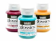
Acrylic Paints offer versatility and quick drying for contemporary techniques. Golden Heavy Body and Liquitex Professional provide high pigment loads with water cleanup while maintaining permanent, flexible results when dry.
Acrylic Paints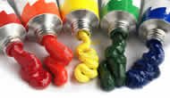
Oil Paints remain the standard for traditional painting techniques. Winsor & Newton Artists' and Gamblin offer superior color depth, extended blending time, and archival permanence for professional artwork.
Oil Paints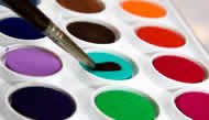
Watercolor Paints excel in transparent applications and luminous effects. Winsor & Newton Professional and Schmincke Horadam combine finest pigments with gum arabic binders for professional transparency and flow control.
Watercolor Paints
Gouache and Opaque Watercolors provide matte, opaque coverage for illustration and design work. Winsor & Newton Designers' Gouache and Holbein Artists' Gouache offer intense opacity with water-based convenience.
Gouache and Opaque Watercolors
Tempera Paints offer fast-drying, matte finishes for educational and professional applications. Traditional egg tempera and modern acrylic tempera formulations provide quick coverage with water-based cleanup.
Tempera PaintsShop Painting Supplies
Professional painting supplies for every application
Acrylic Paints
by Staedtler

2
Versions of this item
From: $8.96
94 Spray Paint
by MTN

107
Versions of this item
From: $10.88
Gouache Binding Medium
by Sennelier


$37.04
Fabric Medium
by Liquitex

$10.21
Ezumitan Watercolor
by Aitoh

$26.63
Essentials Watercolor Small Clearview Art Set
by Royal & Langnickel

$17.49
Flat Aluminum Primer
by Rust-Oleum

$39.94
Flashe Vinyl Paint Set
by Lefranc & Bourgeois

$25.19


